Walk into a room with pale, sun-washed floors and it feels open, calm, airy. Walk into the same room with dark espresso floors and it feels grounded, intimate, luxurious. Same architecture, same furniture, same light — completely different experience.
Tone is the most powerful tool in flooring, and it's consistently the most underestimated one. Here's how to use it intentionally.
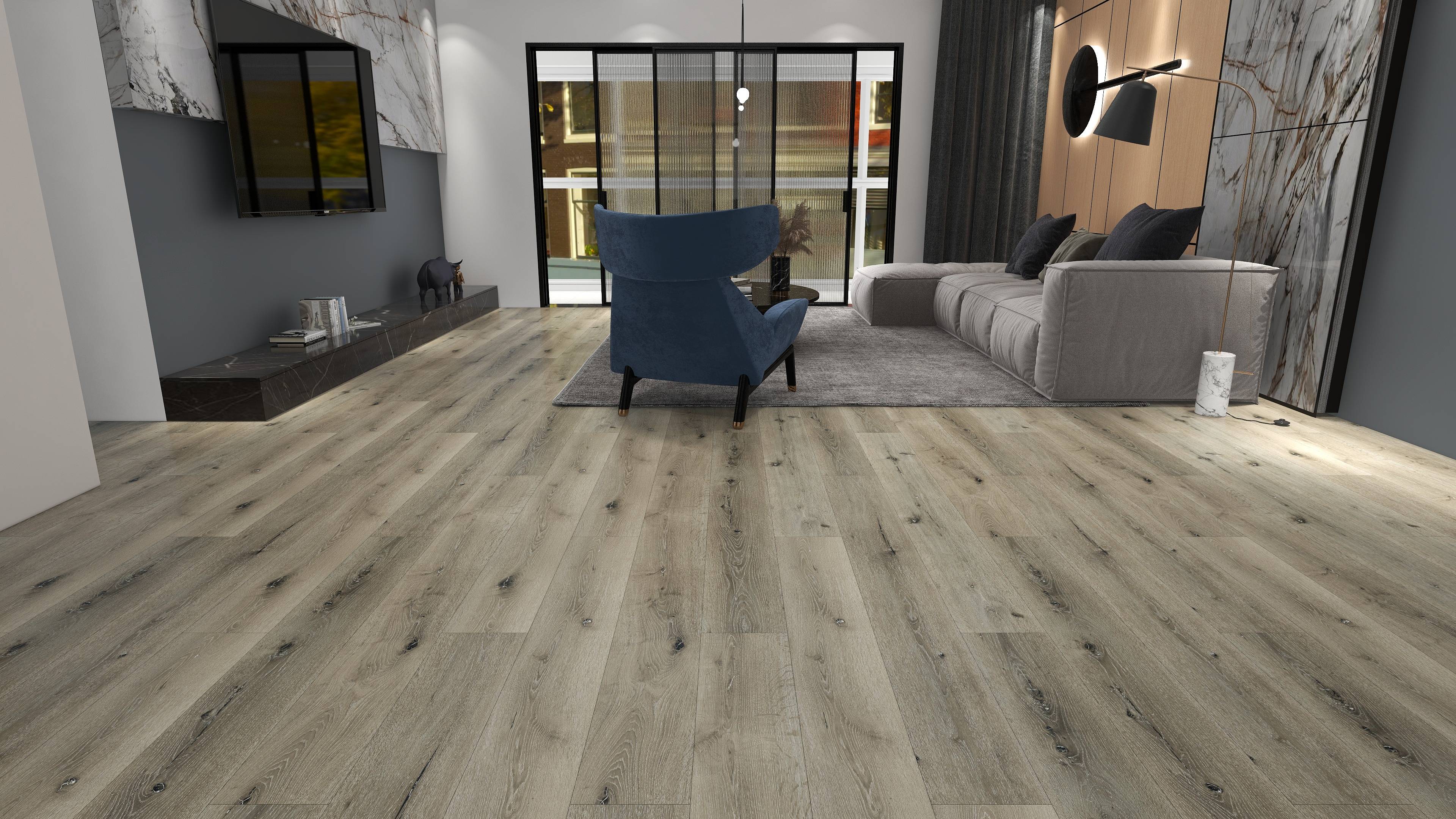
How tone affects perceived space
Light floors expand a room visually. The eye reads the floor plane as receding, which creates a sense of depth. This makes light floors particularly effective in:
- Small rooms or apartments where actual square footage is limited
- Rooms with low ceilings (light floors balance the visual weight)
- Spaces that receive limited natural light (light floors reflect what light exists)
- Open-plan layouts where you want a sense of continuity across zones
Dark floors do the opposite — they define and anchor a space. A dark floor creates a visual foundation that makes furniture and architecture feel more deliberate. This works beautifully in:
- Large rooms where you want to create a sense of intimacy
- Rooms with high ceilings that need grounding
- Spaces with abundant natural light (dark floors absorb glare)
- Formal rooms — dining rooms, studies, libraries — where a sense of weight is appropriate
The contrast principle
The most important consideration is contrast with walls and cabinetry. Rooms where the floor tone closely matches the wall tone tend to feel flat and undifferentiated. Contrast gives the room definition.
This doesn't mean you need extreme contrast — dark floor, white walls — though that reads beautifully. It means thinking about the full range of values in the room and making sure the floor plays its role clearly.
Light floors + white walls: Risk of bleaching out. Add warm accents — wood furniture, textiles, metallic fixtures — to prevent the room from reading as sterile.
Light floors + warm-toned walls: A beautiful combination. The floor reads as natural daylight, the walls as warmth. Very livable.
Dark floors + white walls: Classic, high-contrast, works in almost any style. The floor anchors, the walls expand.
Dark floors + dark walls: Requires commitment and good lighting. Done well — with warm ambient lighting and carefully chosen furniture — it's extraordinarily enveloping. Done poorly, it's just dark.
Undertones matter as much as value
A floor can be light but cool (gray-washed, Nordic, blue-ash tones) or light but warm (honey, cream, blonde). Similarly, a dark floor can be warm (walnut, mahogany, amber-brown) or cool (fumed, ebonized, charcoal).
The undertone should relate to the dominant undertone of your space. Warm rooms — exposed brick, natural wood beams, terracotta — want warm floors. Cool rooms — concrete, marble, stainless — can handle cool floors.
Where this goes wrong most often: gray walls paired with warm honey floors. Both can be beautiful individually; together they fight. Neither reads as intentional.
Practical considerations by room
Open-plan kitchens and living areas: Choose a tone that works in both lighting conditions — daytime natural light and evening artificial light. Most floors look different under each. Test samples in both conditions.
Bedrooms: More flexibility here than anywhere else. The bedroom can handle darker, more intimate tones that wouldn't work in a small entryway. If the rest of your home is uniformly light, a dark-floored master bedroom creates welcome contrast.
Hallways and entries: These are the first impression. A tone that's slightly warmer or richer than the rest of the home creates a welcoming transition. Avoid your lightest tone here — it shows dirt aggressively.
Home offices: Lighter, warmer tones support focus and energy. Very dark floors in a workspace can feel heavy.
The showroom lighting trap
Showroom lighting is almost always designed to make floors look their best under incandescent warmth. The same floor in your north-facing bedroom under flat daylight may look completely different.
Always request samples and live with them in your actual space for at least 48 hours before deciding. Put them in the room at different times of day. Put them next to your cabinets, your wall paint, your furniture. The right choice will become evident — and it may not be the one you expected.
The floor is the canvas. Get the tone right and everything else becomes easier.